
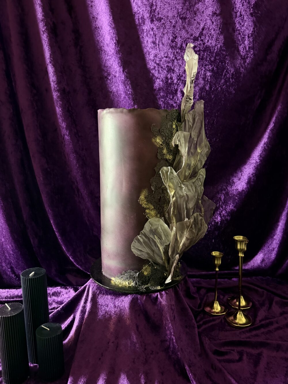
The idea of timeless wedding cake design has always fascinated me, particularly the assumption that timelessness requires restraint, neutrality and an almost complete absence of colour.
There’s a word the wedding industry absolutely adores.
Timeless.
It’s everywhere.
Timeless elegance. Timeless romance. Timeless sophistication. Timeless wedding styling.
And almost without exception, the accompanying imagery is some variation of the same thing.
White. Ivory. Champagne. Soft neutrals. Muted florals. Restrained details.
Beautiful, certainly. But I’ve always found the association rather peculiar.
Because somewhere along the way, we’ve apparently decided that the absence of colour is what makes something timeless.
And as someone who approaches wedding cake design through art, sculpture, architecture and visual culture, I have a question.
Has anyone actually looked at art history?
Timelessness Was Never a Colour Palette
If we look at the objects, artworks and architectural movements that have endured for centuries, something becomes immediately apparent.
They weren’t all subtle.
They weren’t all restrained.
And they certainly weren’t all white.
The Renaissance gave us extraordinary colour, elaborate symbolism and compositions designed to command attention.
Baroque art embraced theatricality, movement, ornamentation and emotional intensity.
Art Nouveau celebrated flowing organic forms, decorative complexity and the relationship between art and nature.
Art Deco brought us geometry, contrast, metallic finishes and unapologetic glamour.
And Pop Art?
Well, Pop Art positively revelled in colour, repetition, popular culture and visual disruption.
These movements were wildly different in their approaches, but they shared something important.
They weren’t trying to disappear into the background.
They were expressing ideas.
And centuries later, we continue to study, celebrate and draw inspiration from them.
Not because they avoided having a personality.
But because they had one.
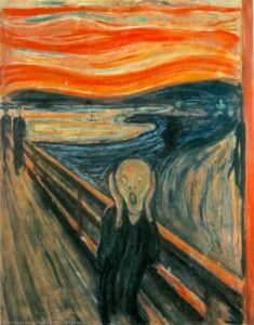
The Renaissance Didn’t Do Beige
Walk through a major art museum and you’ll find centuries of extraordinary artistic ambition.
Rich blues. Deep reds. Gold. Intricate patterns. Monumental compositions.
Artists used colour deliberately.
Pigments carried meaning, communicated wealth, established hierarchy and created emotional impact.
Ultramarine, historically produced from lapis lazuli, was particularly prized in European painting.
Gold wasn’t simply decorative. It could communicate sacredness, status and splendour.
Colour was part of the visual language.
Of course, there were quieter works too. Art history has never belonged exclusively to maximalism.
But the idea that artistic longevity somehow depends on a restrained neutral palette simply doesn’t survive examination.
Some of the world’s most enduring works of art are also among its most visually extravagant.
Nobody stands in front of a Renaissance masterpiece and complains that the artist should have chosen something a little more timeless.
Baroque: When More Really Was More
Then came the Baroque.
Drama. Movement. Emotion. Ornamentation.
Architecture that seemed to move.
Sculpture that appeared almost alive.
Paintings built around theatrical lighting and powerful visual contrasts.
Consider Gian Lorenzo Bernini.
His sculptures remain extraordinary not because they are understated, but because they demonstrate what happens when technical mastery and artistic vision meet.
Stone becomes fabric.
Stone becomes flesh.
Stone becomes movement.
The ambition is part of what makes the work remarkable.
Imagine applying the modern wedding industry’s understanding of timelessness to Baroque art.
Perhaps Bernini could have simplified things a little.
Removed some of the movement.
Made the composition less dramatic.
Something a bit more neutral, perhaps?
Ridiculous, isn’t it?
And yet, creative restraint is frequently presented as though it were inherently more sophisticated than creative expression.
It isn’t.
They’re different approaches.
Neither automatically produces better design.
Art Deco Wasn’t Afraid of Making an Entrance
Art Deco is particularly interesting because it remains enormously influential in contemporary interiors, fashion, jewellery and event design.
Its visual language is unmistakable.
Bold geometry.
Strong silhouettes.
Metallic finishes.
Symmetry.
Contrast.
Luxurious materials.
It was a movement shaped by its own cultural moment, particularly the optimism, modernity and changing tastes of the early twentieth century.
In other words, it was very much of its time.
And yet, more than a century after its emergence, Art Deco continues to inspire designers.
Its enduring appeal doesn’t come from having avoided the aesthetic of its era.
It comes from the strength of that aesthetic.
Which raises an interesting question.
If something can be unmistakably of its time and still be admired generations later, why do we treat being contemporary as the opposite of being timeless?
Andy Warhol Would Like a Word
And then there’s Andy Warhol.
His Marilyn portraits are hardly exercises in restraint.
Electric colour.
Repetition.
Contrast.
An instantly recognisable visual language.
They’re also inseparable from the cultural conditions in which they were created.
Celebrity.
Mass media.
Consumer culture.
Reproduction.
Warhol wasn’t attempting to create work that looked as though it could have been made in any century.
He was responding directly to the world around him.
And that’s precisely why his work matters.
More than sixty years later, those images remain culturally significant.
They haven’t endured because they were neutral.
They’ve endured because they were distinctive, influential and capable of communicating something beyond their immediate moment.
Of course, not every colourful painting becomes a masterpiece.
And not every restrained painting disappears into obscurity.
That isn’t the argument.
The point is that visual restraint and artistic longevity are not the same thing.
Neither are boldness and originality.
A work’s enduring significance comes from considerably more than the colours used to create it.
Perhaps We’re Confusing Timeless With Familiar
I suspect this is where the wedding industry’s relationship with the word becomes particularly interesting.
When people describe a white wedding cake as timeless, what are they actually responding to?
Is it the design itself?
Or is it the familiarity of the visual tradition?
White wedding cakes have a long association with Western wedding culture.
They are recognisable.
Expected.
Comfortable.
They fit an established idea of what a wedding should look like.
And there’s nothing inherently wrong with choosing something traditional.
Tradition can carry enormous personal and cultural significance.
But familiarity isn’t the same as timelessness.
And something doesn’t become artistically superior simply because we’ve seen versions of it for generations.
A traditional white wedding cake may be beautifully designed.
It may demonstrate exceptional craftsmanship.
It may be exactly what a couple wants.
But the colour alone doesn’t make it timeless.
Just as choosing a vivid colour doesn’t automatically make another cake contemporary, original or memorable.
Design requires more thought than that.
The Difference Between Following an Era and Defining One
Every artistic movement exists within a cultural context.
Artists and designers respond to the world around them.
They use the materials, technologies, ideas and visual languages available to them.
Some follow prevailing tastes.
Others challenge them.
And some produce work that eventually becomes part of how we understand an entire period.
But here’s the thing.
We don’t look back at significant artistic movements and admire them because they successfully avoided looking contemporary.
We admire them because they contributed something to visual culture.
Their work had an identity.
Sometimes that identity was quiet and restrained.
Sometimes it was dramatic and confrontational.
Sometimes it was decorative, playful, provocative or entirely unexpected.
What mattered wasn’t whether the work fitted a prescribed aesthetic.
It was what the work achieved.
Art history isn’t a catalogue of things that avoided their era. It’s a record of the things that defined it.
So What Does This Have to Do With Wedding Cakes?
Quite a lot, actually.
Because wedding cakes are designed objects.
They have form.
Proportion.
Structure.
Colour.
Texture.
Silhouette.
Movement.
They occupy physical space and contribute to the visual experience of an event.
They can draw inspiration from architecture, sculpture, fashion, textiles, interiors, personal history and cultural references.
And like any designed object, they can be approached with different levels of ambition.
A cake can be traditional.
Minimal.
Sculptural.
Colourful.
Architectural.
Romantic.
Playful.
Dramatic.
None of those descriptions tells us whether the design is good.
And none determines whether it will feel meaningful twenty years from now.
What interests me is whether a design has been considered.
Whether its elements belong together.
Whether it expresses something about the people it was created for.
Whether it has a reason to exist in that particular form.
Because originality isn’t achieved by simply adding more colour, any more than sophistication is achieved by removing it.
Both require decisions.
And good design is ultimately about the quality of those decisions.
The Wedding Industry’s Peculiar Fear of Looking Dated
There’s another phrase I hear frequently.
But will you still love it in twenty years?
It’s a reasonable question.
Nobody wants to look back at their wedding photographs with regret.
But I wonder why we so often assume that the safest route to future affection is to remove anything distinctive.
Colour.
Pattern.
Personality.
Evidence of the moment in which the wedding actually happened.
As though the ideal wedding photograph should be impossible to date.
But why?
Your wedding takes place at a particular moment in your life.
You are particular people, with particular tastes, relationships, interests and experiences.
The world around you has its own visual culture.
Your clothes, music, interiors and favourite places all reflect something about that moment.
Why should your wedding be expected to exist outside it?
I don’t look at photographs from previous decades and wish everyone had dressed in a way that made the year impossible to identify.
Those details are part of the story.
They tell us something about the people and the time.
And sometimes the things that feel most characteristic of an era become the very things we treasure about it.
There is a difference between a design that follows a passing trend without thought and one that authentically reflects its owners.
The former may lose its appeal when the trend moves on.
The latter can retain its meaning long after fashions change.
A White Cake Can Be Extraordinary. So Can a Pink One.
I want to be very clear about something.
This isn’t an argument against white wedding cakes.
It’s an argument against treating whiteness as evidence of superior design.
A white cake can be an extraordinary piece of sculpture.
It can have exceptional proportions, innovative structure, beautiful texture and a powerful silhouette.
Equally, a colourful cake can be badly designed.
Adding flowers, patterns and dramatic colours doesn’t automatically create artistic merit.
Colour is a tool.
Restraint is a tool.
Contrast is a tool.
Scale, movement, repetition and negative space are tools.
What matters is how they’re used.
My own design work happens to embrace colour, sculptural forms and strong visual identities.
That’s not because I believe every wedding needs to be colourful.
It’s because those are the elements through which I most naturally express ideas.
I made a deliberate decision to concentrate on that kind of work.
Not because traditional cakes lack value, but because I wanted my business to reflect my own creative direction.
And I think there should be room in the wedding industry for designers with genuinely different visual languages.
Without one being labelled timeless and the other being treated as a temporary fashion.
Can Timeless Wedding Cake Design Really Be Defined?
Here’s where I think the whole conversation becomes rather more interesting.
We often talk about timelessness as though it’s a design specification.
Choose these colours.
Avoid these details.
Follow these rules.
And the result will apparently remain beautiful forever.
But history doesn’t work like that.
We can design with longevity in mind.
We can consider proportion, materials, visual balance and craftsmanship.
We can avoid blindly following trends.
What we cannot do is guarantee how future generations will interpret a design.
Cultural tastes change.
Meanings change.
The things we value change.
Some objects once considered fashionable become historical curiosities.
Others are rediscovered and celebrated.
Some works are recognised as significant immediately.
Others only acquire that recognition much later.
Timelessness, in the artistic sense, isn’t simply a quality a designer can declare.
It’s something that becomes apparent through time.
And that makes the wedding industry’s confident use of the word rather amusing.
Particularly when it’s being used to describe a shade of ivory.
What Makes Wedding Cake Design Timeless?
I believe wedding design should be willing to reject tradition. Not for the sake of rebellion, but because tradition should be a choice, never an obligation.
Nor do I believe it needs to chase novelty.
I believe it needs to allow room for individuality.
For considered choices.
For creativity.
For the possibility that something expressive, unconventional or unmistakably contemporary might be just as meaningful in decades to come as something restrained.
Because when we look at the history of art and design, the lesson isn’t that one particular aesthetic survives.
It’s that powerful ideas can survive through extraordinarily different aesthetics.
The Renaissance didn’t need to look like the Baroque.
Art Deco didn’t need to look like Art Nouveau.
Warhol didn’t need to look like Michelangelo.
And none of them needed to avoid the visual language of their own time to leave a lasting impression.
So perhaps it’s time we stopped using timeless as shorthand for white, neutral and familiar.
Perhaps we should ask better questions.
Does the design have purpose?
Does it have integrity?
Does it express something meaningful?
Does it deserve to be remembered?
Because the goal shouldn’t be to create something that belongs to no particular time.
It should be to create something worth remembering.
Crumbdidilyumptious | The Designer’s Journal